Colours: where did they go? An interesting look at colour grading in cinema over the last twenty years or so.

If you watch a lot of movies and TV shows, you might have noticed that over the last few decades everything has gotten a lot more … gray. No matter the kind of story being told, a sheen of cool blue or gray would wash over everything, muting the colors and providing an overall veneer of serious business.


Design Canada ?

design canada title card

Design Canada is a documentary film celebrating the golden era of Canadian design. View the trailer.

I attended the Montreal screening of the film last week and definitely learned a few things. My design history knowledge skews heavily towards Britain and Europe, so it was pretty awesome to see Canadian efforts in the spotlight. I grew up during the period when much of this work was being scrapped in favour of the new, so I never really appreciated some of the systems that we had in place.

The film is showing around the country over the next month, including several more screenings at Cinema du Parc in Montreal. It will be released digitally in the fall.

Thanks to the film’s director, Greg Durrell, for providing me with the film’s title card for this post.


My font was in a movie

My font, Plastic Tomato, appeared briefly in Despicable Me 3.

I get a huge kick out of this, mostly because I made it twenty years ago while I was still in high-school. Grunge design was popular and there was an indie font scene happening on the early web. I churned out a bunch of fonts over the span of a year or two, released them all online, but didn’t take it much further. They managed to make it through several site migrations, and are still tucked away in the dusty type section of the site.

All of the fonts were freely available and had a note attached saying to get in touch if you want to use them commercially. I still get the occasional email, mostly people using them for smaller personal projects. So, I was a bit surprised to get a message from a movie studio asking for clearance to use it.

I wanted to reach out because I’m working on Despicable Me 3 and production is interested in using your Plastic Tomato font for a 1980’s style action figure commercial in the movie. The font would be seen on screen (along with other fonts) stating the action figure’s features. If you’re okay with the use, we’d appreciate it if you could sign the attached clearance request.

I signed the request, but wasn’t sure if it would actually make it into the movie. Never got around to seeing it in the theatre, but grabbed a copy when it was released digitally.

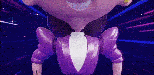
And there it is, the font I made in high-school, on-screen (gif) for approximately two seconds!


The 92 year old bootlegger

One of the world’s most prolific movie pirates is a pensioner from Brooklyn.

“Big Hy” — his handle among many loyal customers — would almost certainly be cast as Hollywood Enemy No. 1 but for a few details. He is actually Hyman Strachman, a 92-year-old, 5-foot-5 World War II veteran trying to stay busy after the death of his wife. And he has sent every one of his copied DVDs, almost 4,000 boxes of them to date, free to American soldiers in Iraq and Afghanistan.


Therapist for screenwriters

Barry Michaels helps screenwriters get over writer’s block.

By far the most common problem afflicting the writers in Michels’s practice is procrastination, which he understands in terms of Jung’s Father archetype. “They procrastinate because they have no external authority figure demanding that they write,” he says. “Often I explain to the patient that there is an authority figure he’s answerable to, but it’s not human. It’s Time itself that’s passing inexorably. That’s why they call it Father Time. Every time you procrastinate or waste time, you’re defying this authority figure.” Procrastination, he says, is a “spurious form of immortality,” the ego’s way of claiming that it has all the time in the world; writing, by extension, is a kind of death.


A better Big Lebowski kit

Two Lebowski Kits fight it out

I recently saw a link to The Big Lebowski Kit somewhere, clicked through and was expecting something entirely different. I was thinking it would be The Dude’s kit; everything that one needed to get their dude on. Nope, it’s just a bunch of useless crap… “Ooooh, a mousepad, a fake toe and a coffee cup!” We can do a little better than that.

The Dude’s Survival Kit

Here’s what I think should be in The Dude’s survival kit.

  • bottle of Smirnoff vodka
  • bottle of Kahlua
  • carton of cream
  • Old Fashioned glass
  • ice cubes
  • roach clip
  • rolling papers

We could probably include some sort of bowling paraphernalia: a ball, a shirt, something bowlingish. And we would need something to hold it all, possibly a battered suitcase or a bowling bag.


Alice as mathematical satire

The absurdity in Alice in Wonderland is often attributed to drugs or a dark trip into the subconscious. For her PhD work, Melanie Bayley examined some of the most popular scenes from a mathematical perspective, which is summed up in Alice’s adventures in algebra. Charles Dodgson (aka Lewis Caroll) was a rather conservative mathematician, who disagreed with many of the new mathematical theories emerging during the 19th century.

The madness of Wonderland, I believe, reflects Dodgson’s views on the dangers of this new symbolic algebra. Alice has moved from a rational world to a land where even numbers behave erratically.

I don’t imagine that Tim Burton’s new Alice in Wonderland will delve too deeply into mathematical theory.